Shadow and light
Branding
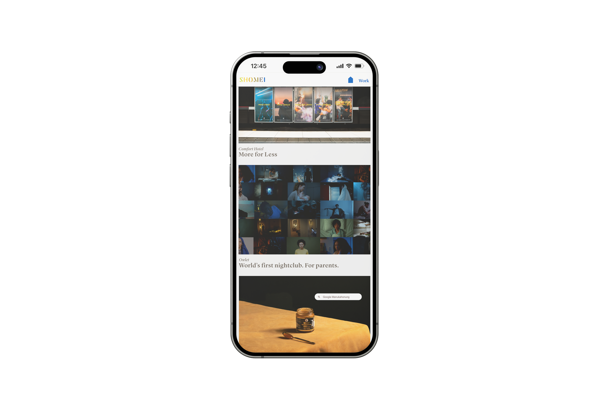
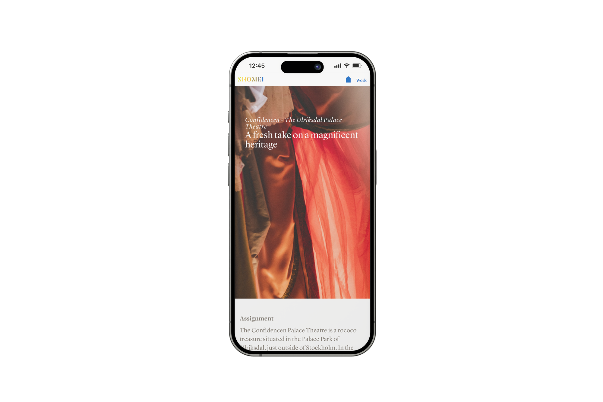
Agency: Shomei
My role: Art direction / Identity design / Brand strategy / Web design
Creative team: Anna-Karin Elde, Creative Director & Copywriter
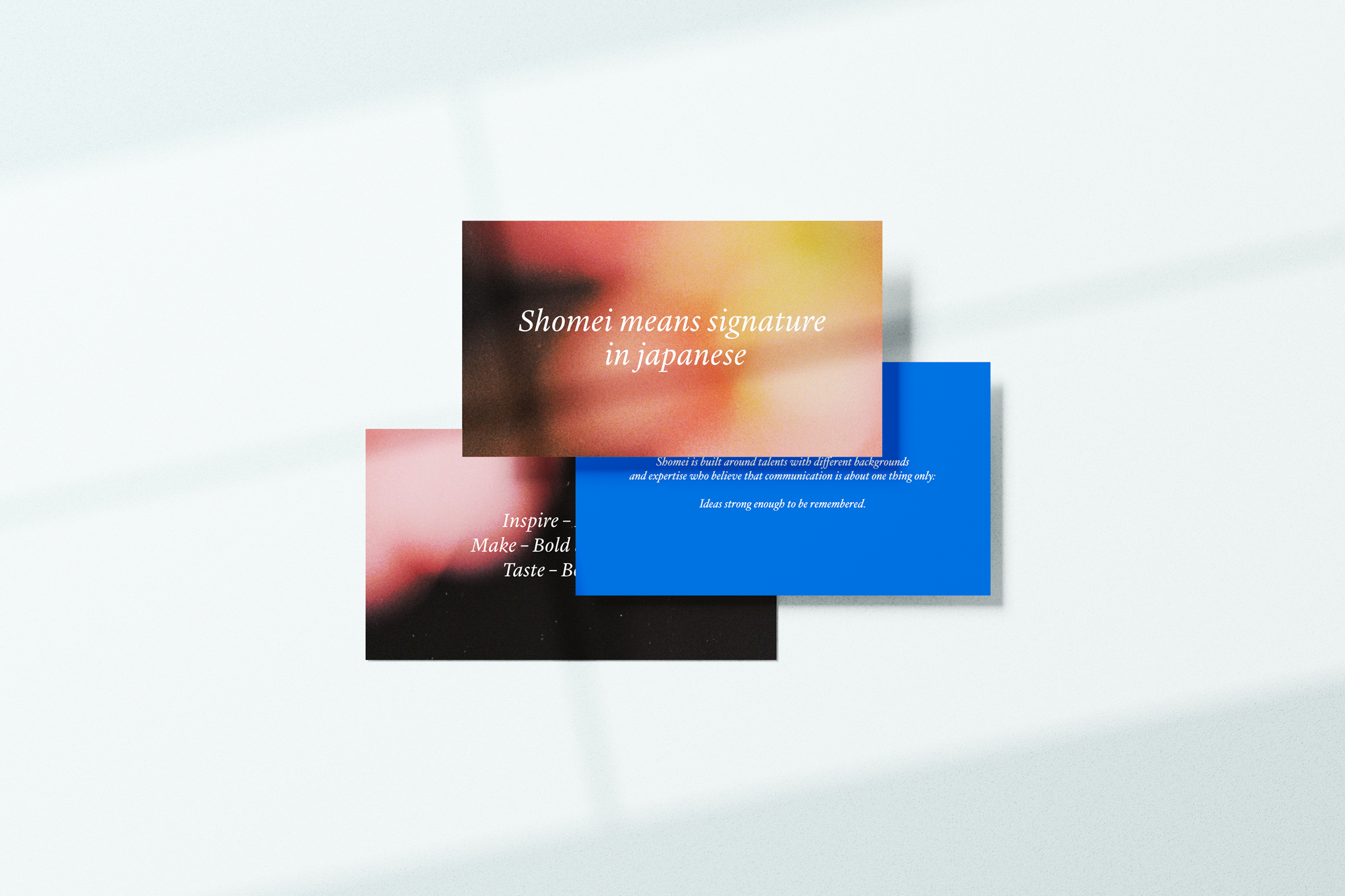
The creative communications agency Shomei rebranded and the new identity needed to reflect the versatility of the agency, shaped by its many different people and disciplines. Shomei means signature in Japanese, an idea that became central to the identity: every collaborator leaves a mark, while the agency leaves a signature on each project.


Solution
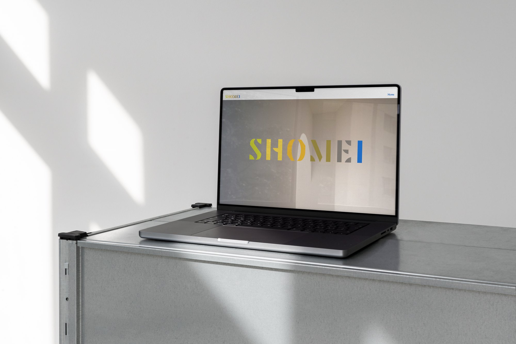
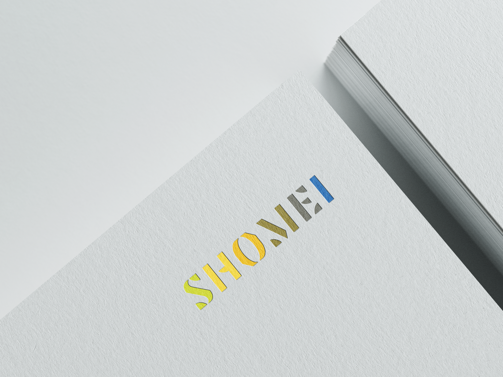
The identity is built around the interaction of light and shadow, forming an architectural visual language. The logotype is designed as a flexible system, where the signature “S” can be activated through shifting light, suggesting time, movement, and spatial depth. This principle extends into the color system, structured in three calibrated scales: a core palette, a mid palette, and a shadow palette used sparingly to introduce contrast and hierarchy. Allowing for a little complexity.